- Product design
- UX design
- Branding
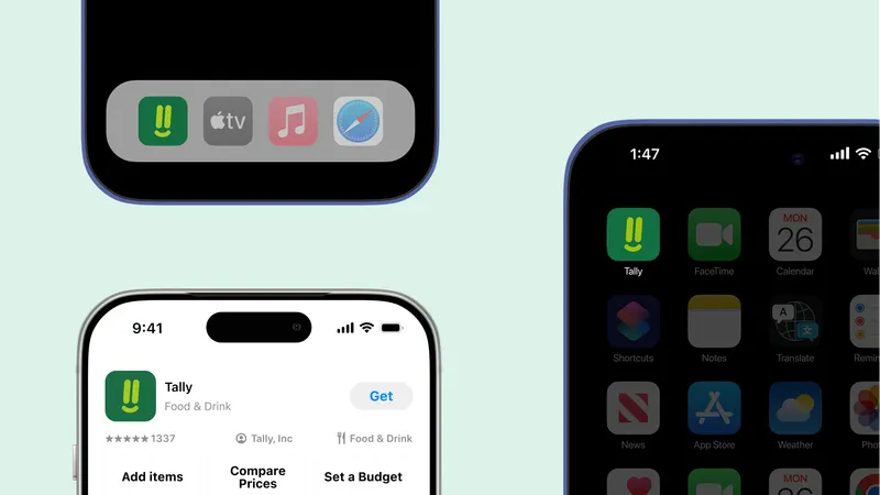
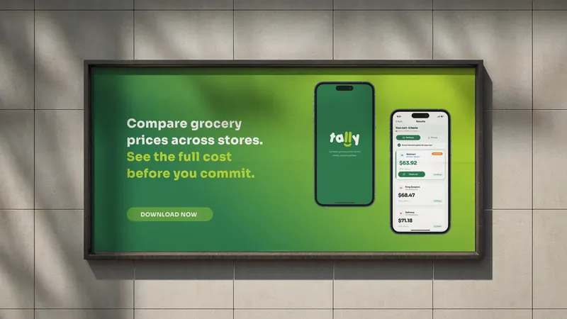
Tally
A grocery price comparison app. Build your cart once, see the real total across stores including all fees, then decide where to shop.
- 4 User interviews
- 100% Pain point validation
- 6 Step optimized user flow designed
Overview
Tally is a centralized grocery price comparison app. It tackles a real and overlooked problem: the mental and emotional weight of comparing grocery orders across multiple stores and delivery platforms.
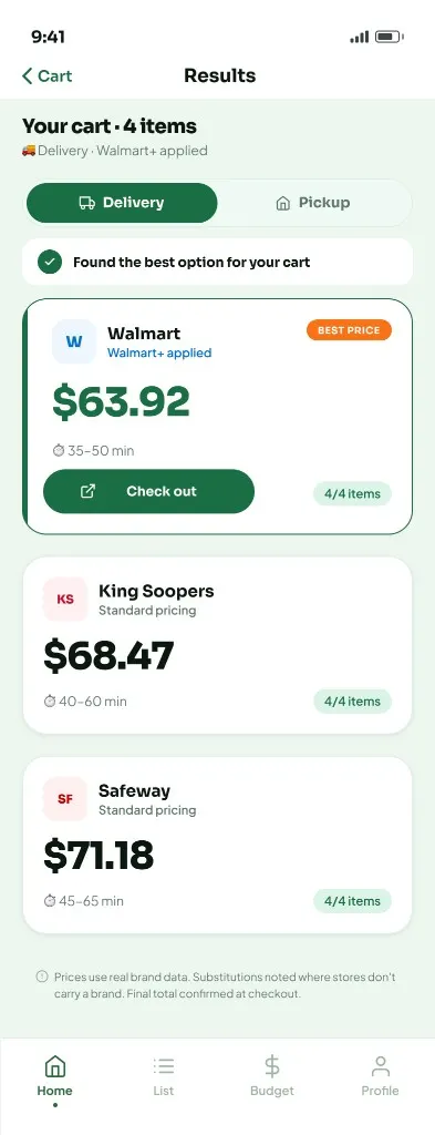
Users build their cart once inside Tally. The app calculates the real total cost across multiple stores.
The problem
Walmart, King Soopers, Safeway, Instacart, Amazon Fresh, Target. Each has different prices, different availability, and fees that only appear at checkout. Finding the best deal means rebuilding your cart on every platform and keeping the math in your head.
The deeper issue is not just time. It is the mental drain. Hidden fees, unclear totals, and repeated comparison create decision fatigue and uncertainty. Users are not only trying to save money. They are looking for the confidence to stop searching.
Too many platforms. Too many hidden fees. The same cart, rebuilt every time.
Project objectives
-
Map how users compare grocery prices—and where time and mental effort are lost.
-
Study existing comparison tools: patterns, limits, and gaps.
-
Surface pain points in fees, transparency, and fragmented workflows.
-
Design flows to compare item and cart costs in one place.
-
Present complex pricing clearly and scannably.
-
Prototype and test how centralized comparison cuts decision fatigue.
Market context
Grocery inflation keeps rising. Delivery fees are often unclear until checkout. Consumer Reports recently found that Instacart runs AI pricing experiments, charging different users different prices for the same item at the same store.
- 47% say delivery prices are too high
- 55% have removed items from cart due to cost
- $8–15 typical hidden fees per order
- $920B+ US grocery sales per year
Competitive landscape
Existing tools focus on individual item prices, deal alerts, or single-store catalogs. None combine full basket comparison, true total cost with all fees, and a clear recommendation in one place.
Behavioral background
-
Choice overload
When people face too many options, they are less likely to choose at all. Multiple grocery platforms with different pricing creates exactly this kind of overload.
-
Decision fatigue
Every comparison uses mental energy. By the time someone checks a third platform, the ability to evaluate the next one has already dropped, leading to impulsive choices or giving up entirely.
-
Regret aversion
The fear of choosing wrong is often stronger than the desire to choose right. People keep looking not because they expect something better, but because they are afraid of missing something.
Research: survey
A short survey was distributed to gather quantitative insight into how often people compare prices and what makes the process difficult. Respondents were primarily 23 to 32 year olds who shop for groceries online regularly.
-
90%
order groceries primarily online
-
Most
are often surprised by the final total at checkout
-
Top 3
priorities while shopping: total cost, delivery fees, and discounts
-
All
coordinate grocery shopping with at least one other person
Research: interviews
Four one-on-one interviews were conducted with US-based adults who order groceries online at least twice a month. Sessions covered current behavior, emotional pain points, fee transparency, and what confidence would actually feel like. Themes were captured through affinity mapping.
-

"I will spend half an hour going back and forth between Instacart and Walmart."
Described a near-ritual process of rebuilding the same cart in two or three apps every Sunday, motivated by finding a better deal, but usually resulting in exhaustion and lingering doubt.
-

"I know I am probably paying more than I should. I just do not have the energy to keep checking three apps every time."
Stopped comparing entirely. Uses Walmart by default, not because he believes it is cheapest, but because checking alternatives feels worse than the possibility of overpaying.
-

"I'll check one more app just to see if it's actually cheaper, but it's annoying to keep going back and forth."
Pays for Walmart Plus but still ends up checking another app when the total feels high. Said it would be useful to see the total across stores in one place, especially with delivery and pickup differences.
-

"If I do pickup, Safeway is sometimes cheaper. If I do delivery, King Soopers wins. I have to do that math myself every single time."
Uses pickup almost exclusively to avoid delivery fees. Pointed out that switching from delivery to pickup can completely change which store is cheapest, and that no app currently makes this easy to compare.
Research synthesis
-
Cart rebuilding is the biggest pain point
Re-entering the same items across multiple platforms is the most consistently named frustration. Every interview surfaced it within the first five minutes.
-
Fee hiding destroys trust
Service fees, dynamic pricing, and surprise charges make the final total unpredictable. Users feel misled at checkout, even on platforms they pay for.
-
Decision fatigue causes people to give up
Many users stick to a single platform out of exhaustion, not loyalty. The act of comparing feels worse than the prospect of overpaying.
-
People want a recommendation, not a spreadsheet
They do not want more data. They want something to say: this is your best option, and here is why. They want permission to stop searching.
Users are not just searching for the cheapest option. They are searching for the confidence to stop looking.
Design response
Tally answers the research with four core ideas. Each one maps directly to a finding.
-
One cart, three stores
Search and add items inside Tally. The same cart compares across Walmart, King Soopers, and Safeway automatically.
Maps to: Cart rebuilding -
True total cost
Every comparison includes item prices, delivery fees, service charges, and taxes. What you see is what you will pay.
Maps to: Fee hiding -
A clear recommendation
One winner. Visible trade-offs. A reason to stop searching and place the order.
Maps to: Decision fatigue + want a recommendation -
Shared lists
Multiple people add items into one combined cart, compared as a single order. No more text-message coordination.
Maps to: Pickup vs. delivery + coordinating with others
Information architecture
The app is organized around four sections, accessed through a bottom navigation bar.
-
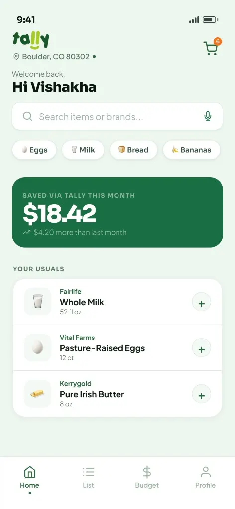
Home
- Search & quick add
- Cart in progress
- Comparison results
- Store redirect
-
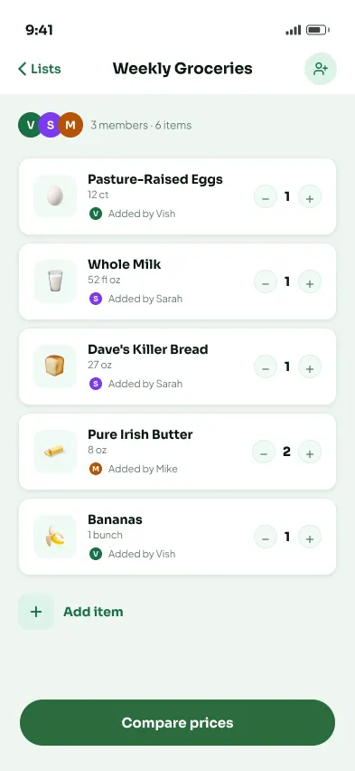
List
- Shared and solo lists
- Live cheapest bar
- Compare CTA
-
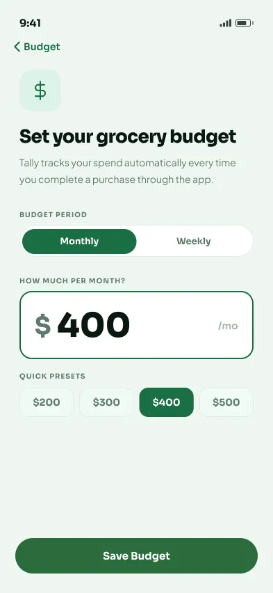
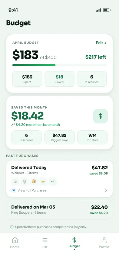
Budget
- Spending tracker
- Savings widget
- Purchase history
-
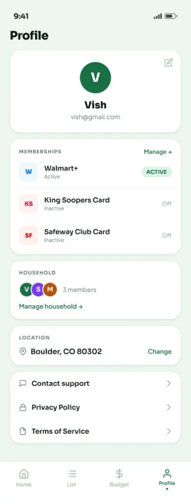
Profile
- Memberships
- Household members
- Location & settings
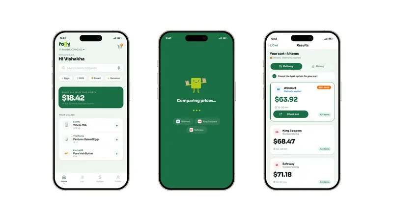
Core user flow
The core journey moves from home to redirect in six steps. No platform selection. No cart rebuilding. No surprises.
Key screens
-
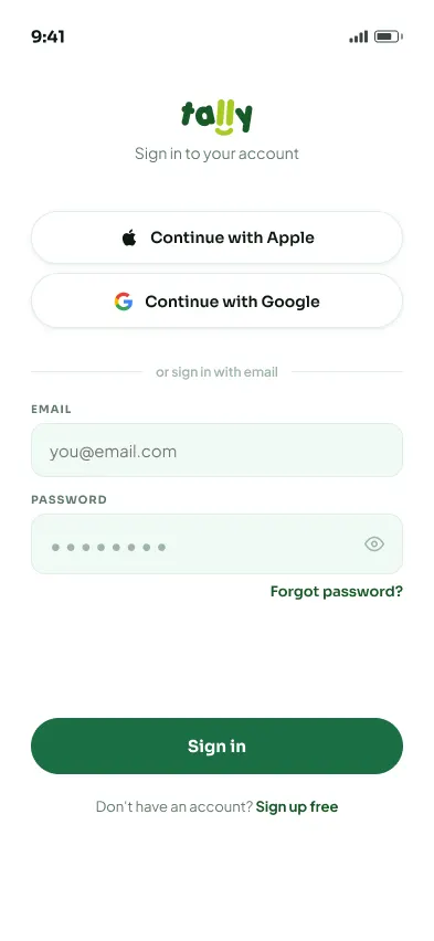
Sign in with your details, one clear starting point.
-
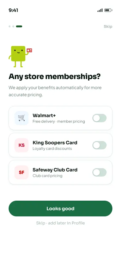
Add store memberships so prices reflect your real discounts.
-
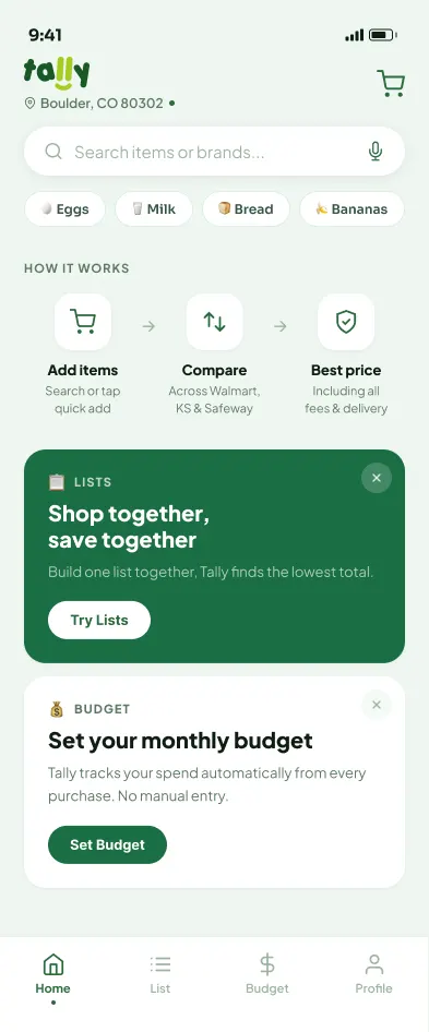
New users: how it works first, then discover Lists and Budget.
-
Returning users: search, quick add, savings snapshot, and usual items.
-
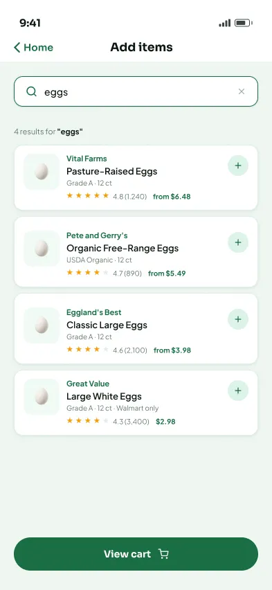
Shows results with ratings, pack size, and starting price so users can add items easily.
-
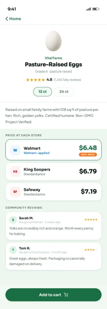
Displays prices across stores, highlights the best option, and includes reviews.
-
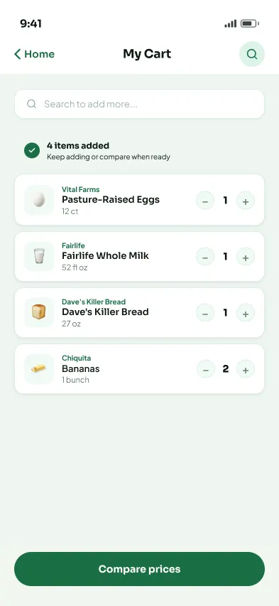
Review items, adjust quantity, and compare when ready.
-
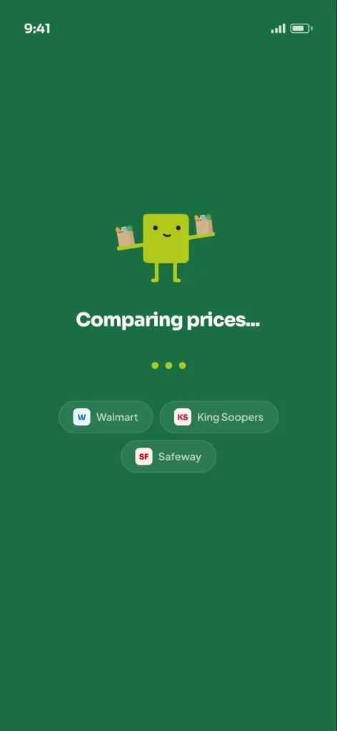
Tally compares prices across stores with clear progress feedback.
-
Shows total cost across stores with delivery or pickup, highlighting the best option.
-
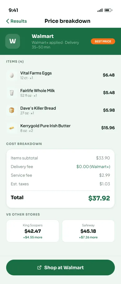
Breaks down items, fees, taxes, and total, with quick comparison to other stores.
-
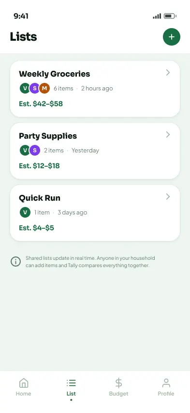
Displays saved and shared lists with estimated totals and members.
-
Shows who added what, lets users update items together, then compare as one cart.
-
Set a grocery budget amount to track spending.
-
Tracks spending, savings, and past purchases in one place.
-
Manage memberships, household, location, and account settings.
Visual identity
The Brand
A visual identity built for trust and calm.
Brand strategy
Most grocery and delivery platforms are built to drive action, not clarity. Tally positions itself differently: less like a marketplace, more like a financial tool.
The problem with existing brands
- Discount-heavy visuals and urgency cues
- Loud, competing color systems
- Promotional messaging over real cost
- Interfaces that feel busy and inconsistent
Tally's approach
- Visual restraint instead of promotion
- Deep, grounded colors that signal stability
- Clean typography that supports clarity
- A tone that informs, not persuades
Design and name exploration
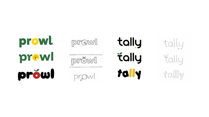
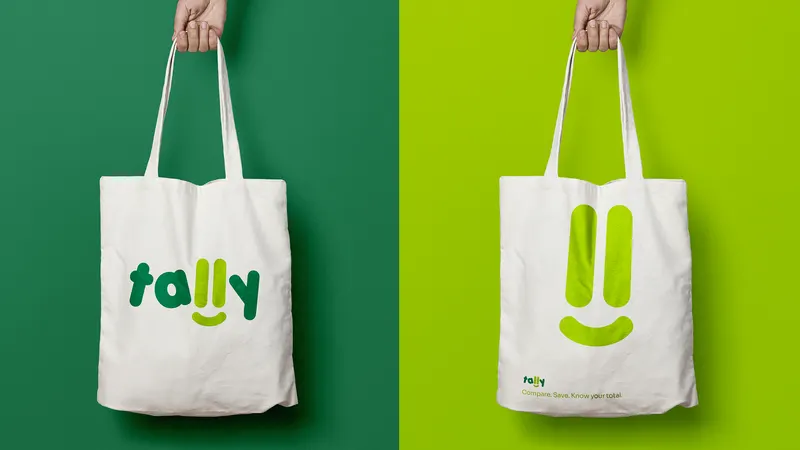
Logo
That double meaning shaped the logo: the two lowercase "ll" characters are drawn to visually echo tally marks, with a soft smile placed directly below them. The result is a mark that is functional, warm, and immediately readable at any size.
from "ll"
below marks

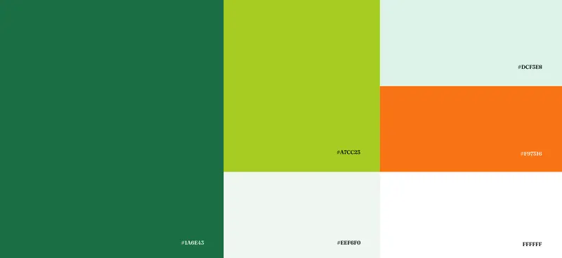
Color system
Deep green anchors the brand in stability and confidence. Orange provides warmth and guides attention without creating urgency. Mint softens the experience for longer use. Lime is reserved for savings callouts and small accent moments.
Typography
Brand wordmark
Porky
Aa Bb Cc Dd Ee Ff Gg Hh Ii Jj Kk Ll Mm Nn Oo Pp Qq Rr Ss Tt Uu Vv Ww Xx Yy Zz
0123456789 $63.92
LOGO
App primary
Sora
Aa Bb Cc Dd Ee Ff Gg Hh Ii Jj Kk Ll Mm Nn Oo Pp Qq Rr Ss Tt Uu Vv Ww Xx Yy Zz
0123456789
HEADINGS, NAV, PRICES, BUTTONS
App body
Jakarta
Aa Bb Cc Dd Ee Ff Gg Hh Ii Jj Kk Ll Mm Nn Oo Pp Qq Rr Ss Tt Uu Vv Ww Xx Yy Zz
0123456789
BODY, DESCRIPTIONS
Type scale
Iconography
All product icons are drawn from a single Lucide-based library with rounded joins and a 2px stroke. Food and grocery items use emoji exclusively, with no icon illustrations. This keeps the icon system consistent and the product catalog expressive without requiring a custom illustration set.
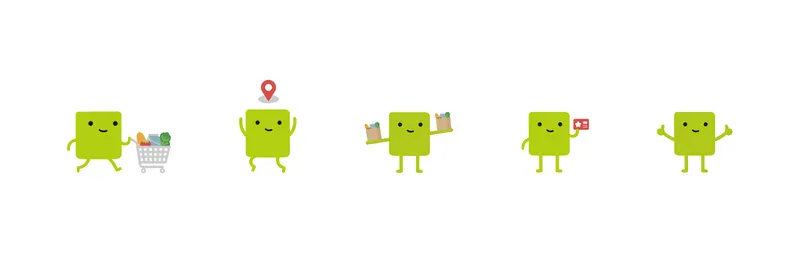
Character design
A geometric mascot appears during onboarding, empty states, and marketing. It never appears in the main product interface. Its role is warm and ambient, providing a human touch without distracting from the core task.
Brand voice
- Calm, not anxious or salesy. No urgency tactics. No "limited time" pressure.
- Direct, no jargon. If a sentence sounds like marketing, it gets cut.
- Honest about trade-offs. If pickup is cheaper but slower, the app says so.
- Reassuring, not loud. Confidence comes from clarity.
Applications
The brand system applied across product and marketing contexts.
Reflection
User research revealed a clear pattern: even after making a decision, people still felt overwhelmed and unsure. What users needed wasn’t more features, but more clarity.
The initial instinct was to add more: filters, data, and control, but feedback showed that this only increased the burden. Users wanted less: less choice, less doubt, and less effort to feel confident.
That insight shaped the product. Each round of feedback made it clearer that the design improved by removing, not adding, proving that good problem-solving is often about knowing what to cut.