- Brand identity design
- Logo design
- Graphic design
Odisha Design Week
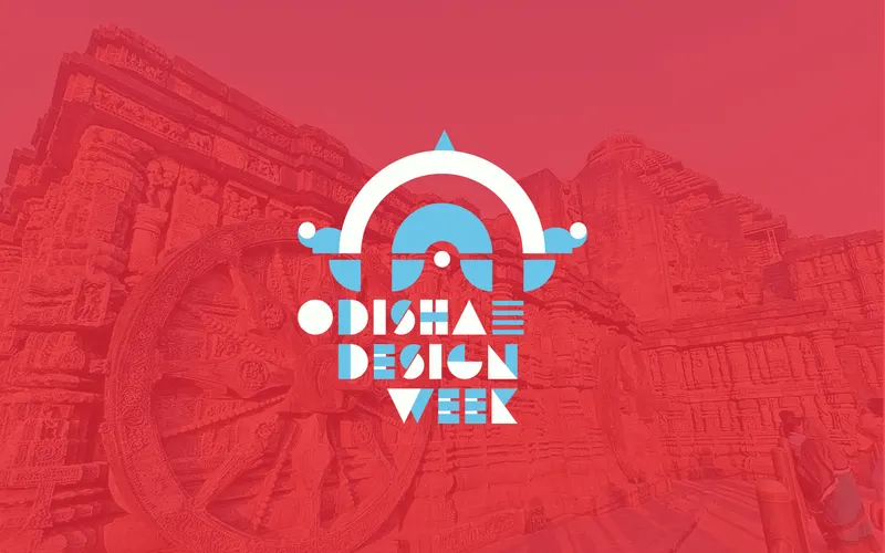
A brand identity for a cultural design festival that balances traditional influences with contemporary design to create a recognizable and scalable system.
-
20+
touchpoints shaped by
a unified brand system -
3-day
international
design festival -
30+
speakers from global design
and academia
Overview
Odisha Design Week is a design festival that bridges the region's cultural heritage with contemporary practice, through events and programming that raise awareness of design and promote Odisha as a destination in the global design conversation.
As a first-time festival, it needed credibility with participants, the public, artisans, and sponsors, including the Government of Odisha and private partners.
Problem
Before
- No distinct brand identity or visual language
- No cohesive web presence
- Hard to reach broad audience & win sponsors
After
- Culturally rooted, globally legible identity
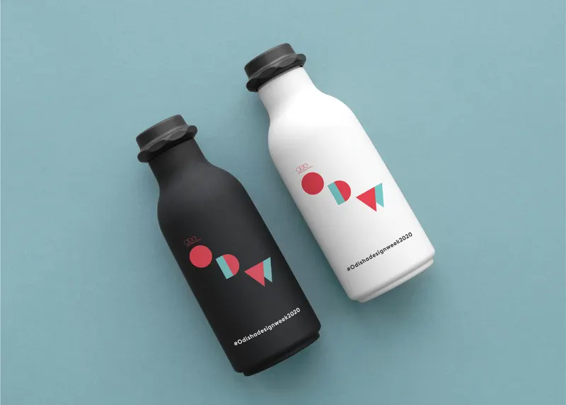
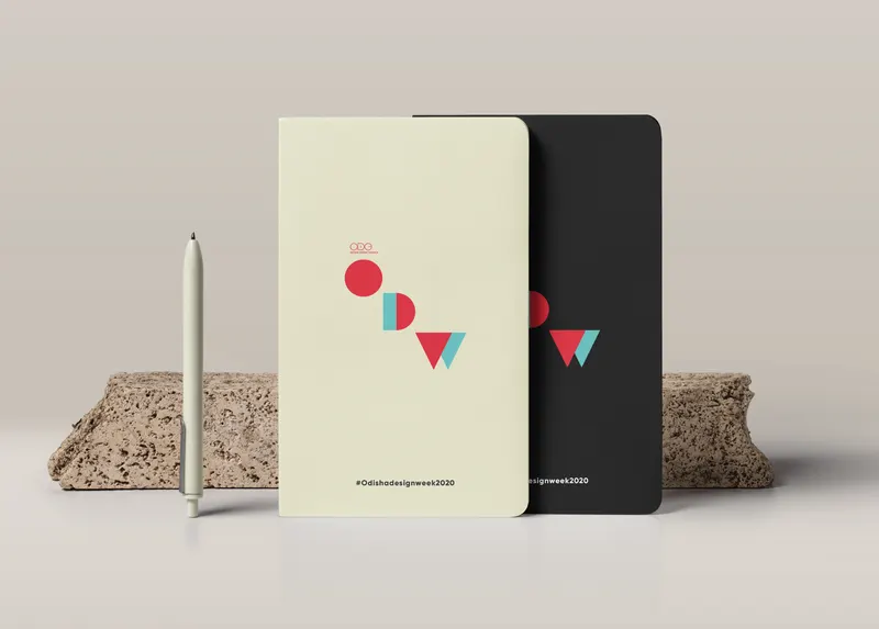
- Cohesive expression across 20+ touchpoints
- Recognized with India's Best Design Award 2023
Logo concept
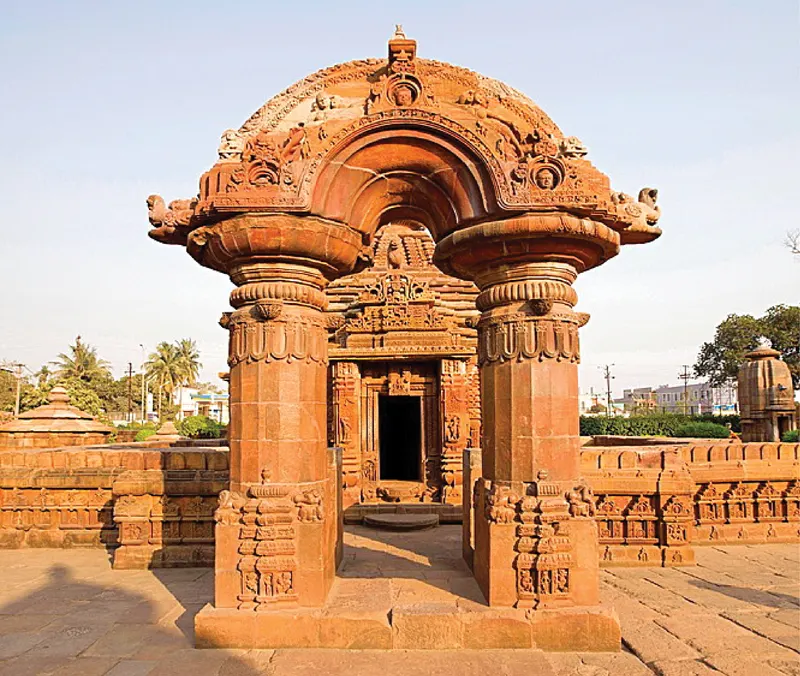
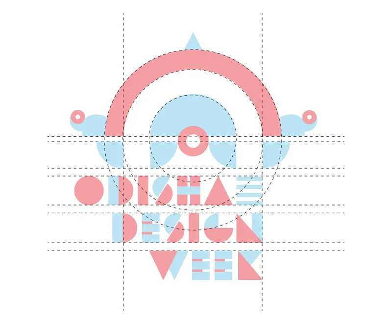
The logomark traces its form directly from the sacred architecture of Odisha.
Mukteswara Temple, a 10th-century gem of Odisha's Kalinga architecture, known for its intricately carved arch.
The arch form was stripped of ornamentation and redrawn as a clean geometric shape, retaining the sense of a threshold and gateway.
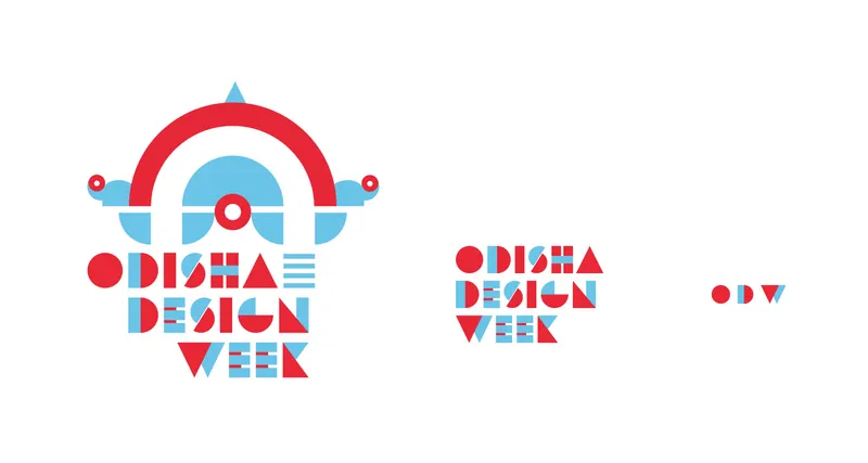
A contemporary logomark that carries cultural weight, rooted in heritage, legible at any scale.
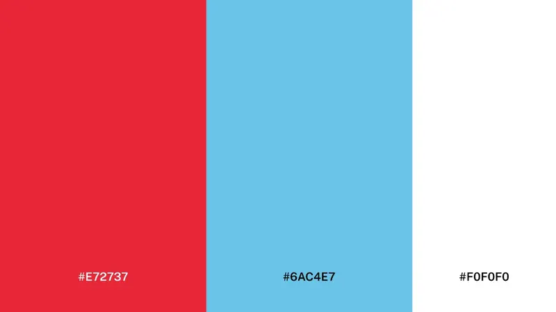
Color palette
Typography
Primary typeface
Gilroy
Regular · Medium · Bold · Black
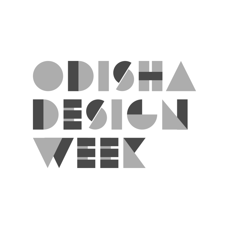
The typeface is inspired by Pipli Applique Work, a traditional artwork of Odisha.
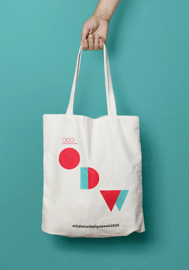
The design treatment mimics the traditional craft's overlapping form.
Type scale
Outcome
The identity helped position Odisha Design Week as a culturally grounded, globally legible festival. Consistent expression across platforms strengthened engagement and sponsorship conversations.
The work was recognized with India's Best Design Award for Visual Identity Design 2023 (opens in new tab) for contribution to cultural branding and design excellence.