- Brand identity
- Graphic design
Around the Corner
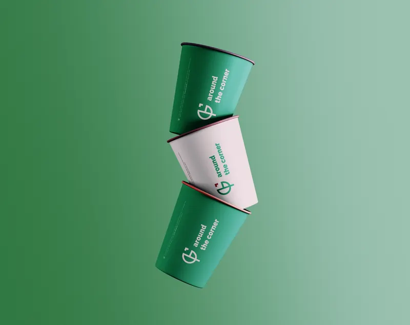
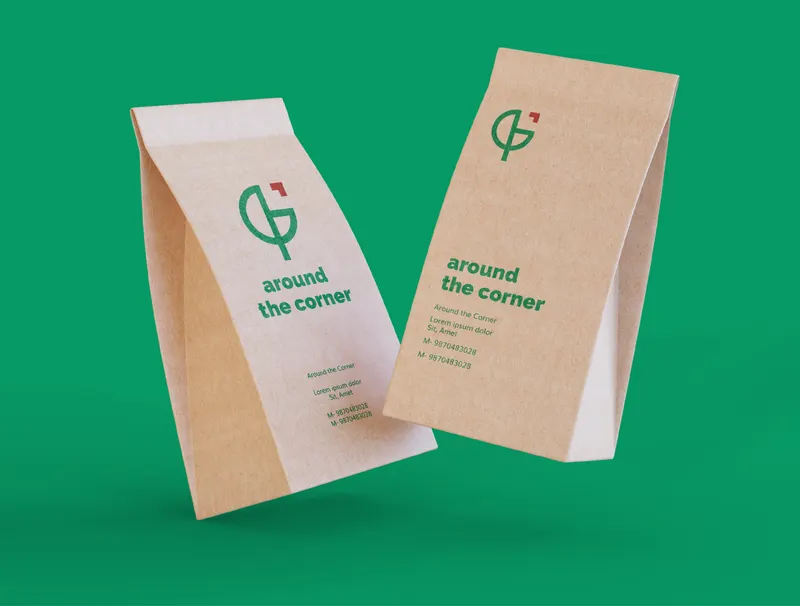
A rebrand for a multi-cuisine café, focused on translating its calm, nature-inspired environment into a clear and cohesive visual identity.
Background
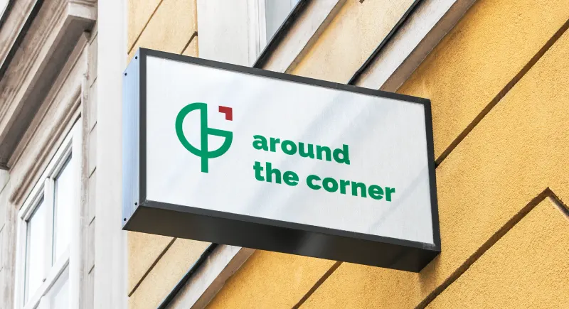
Around the Corner is a multi-cuisine restaurant designed as a quiet escape from city life, combining good food with a natural, plant-filled setting. The goal of this project was to reimagine the brand identity so it better reflected the restaurant’s atmosphere, values, and dining experience, while creating a cohesive visual system that could extend across physical and digital touchpoints.
Problem
The existing brand identity did not clearly communicate what made Around the Corner special. While the restaurant offered a calm, nature-driven dining experience, the logo and visual language felt disconnected from this environment and lacked a strong, memorable presence. The challenge was to create a brand that expressed warmth, greenery, and comfort, while still feeling modern and versatile across applications.
Concept
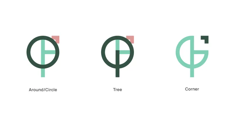
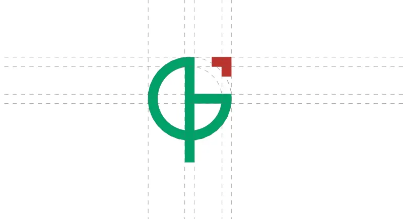
The logo concept was developed by combining three key ideas: around, corner, and nature. Circular forms suggest continuity and warmth, while the tree element symbolises growth, freshness, and the restaurant’s green environment. The “corner” idea hints at a cozy, tucked-away space, a hidden, calming escape.
Color palette and typography
Raleway
Regular Bold
ABCDEFGHIJKLMNOPQRSTUVWXYZ
abcdefghijklmnopqrstuvwxyz
123456789$?&%!#*()=